Would You Spend $48 On This Palette?
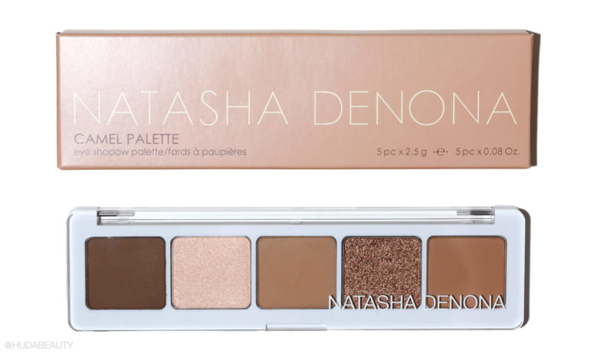
Having the perfect neutral eyeshadow palette is an essential in anyone’s makeup kit! And, as someone who loves a classic makeup look, I can really appreciate every shade of brown, taupe, ochre, mahogany, and everything in between. So, when I saw Natasha Denona had done an edit of brown hues, the Natasha Denona Camel Eyeshadow Palette, $48, I had to try it out. I love how Natasha Denona selects colors, and the quality of her shadows is always impressive – they’re buttery, pigmented, and long-wearing. Here’s what I thought of the new palette.
What it is: A five-pan eyeshadow palette with a collection of camel-toned shades. The palette features three mattes, one satin, and one metallic. From left to right:
Arrosto – A deep brown with a yellow undertone and matte finish
Dune – A pale golden shade with peach undertone and satin finish
Safari – A medium dusty brown shade with a matte finish
Copper Stone – A rich bronzey-copper shade with a golden nude reflect in a matte finish
Zand – A medium warm ochre with a matte finish
What we liked: I like that this is quite a neutral shade collection, and the three matte brown shades work really nicely together, so you can create a variety of neutral looks, whether you want to do something quite simple or more dramatic and smoky. I found the matte formula was really creamy and nicely pigmented (Safari, was less pigmented), but not so intensely pigmented that it was difficult to work with and blend. The Copper Stone shade is a really pretty metallic that looks stunning on the inner corner, center of the lid, and lower lash line.
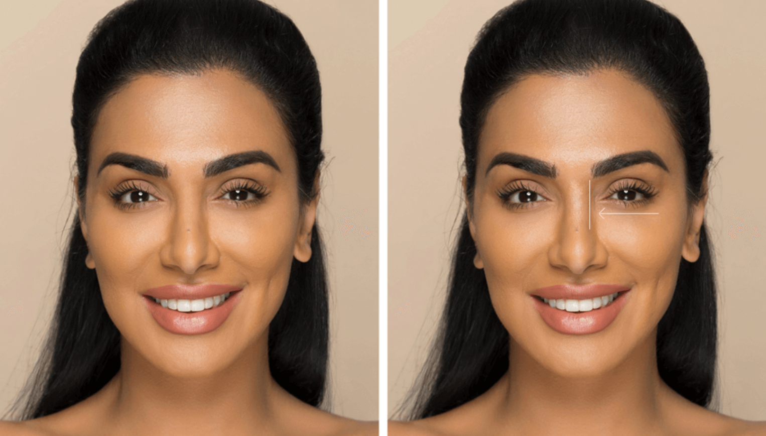
Okay, so I know this is an eyeshadow palette, but honestly, I found that this worked really well as a full face palette! Safari made a really nice shade for nose and lip contouring (it has a slightly greyish undertone) while Zand can be used lightly for contouring on fair-to-medium skin tones, and Arrosto, which is a such a nice rich coffee shade, will work beautifully on deeper skin tones. You could even use Arrosto for your brows!
What we didn’t like: The cream shade, Dune, looks really intense when you use your finger, but it’s a lot more subtle on a fluffy brush, and I wish it were more powerful, as it’s not as vibrant as the other metallic and shimmer formulas from Natasha’s other palettes. You can use a little setting spray on a dense brush, which helps intensify it if you want to use it on the inner corner. I also used Dune as a highlighter, and because it’s so subtle, it helps to give a really natural glow to cheekbones and down the center of the nose. I also found that when I was using the palette with my fingers, the pans were moving around a little in the palette, which I wasn’t a fan of.
The verdict: I think this is a nice palette, but I already have all of these shades covered in other neutral palettes, so for me, I wouldn’t spend $48 on these five shades just to use on my eyes. That said, if you don’t have a neutral palette (this is truly neutral, not too warm or cool toned), then these five shades are great. I also think if you use this as a face palette, you can get a lot more out of it, which makes the $48 seem so much more worthwhile.
Shop it here.








Leave a comment